


I don’t like my comprehensives. I have finally found a use for AI art though. It’s not so much that you can type what you want and get a finished product. It’s that you can use it as a sketchbook, see if colors or compositions work, or use it like DADA would use lost object art.
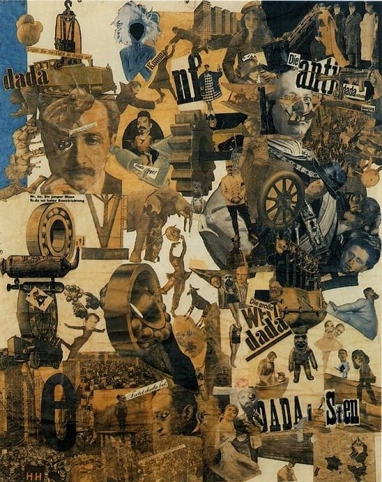
So what I’ve had and what I like or don’t like so far:
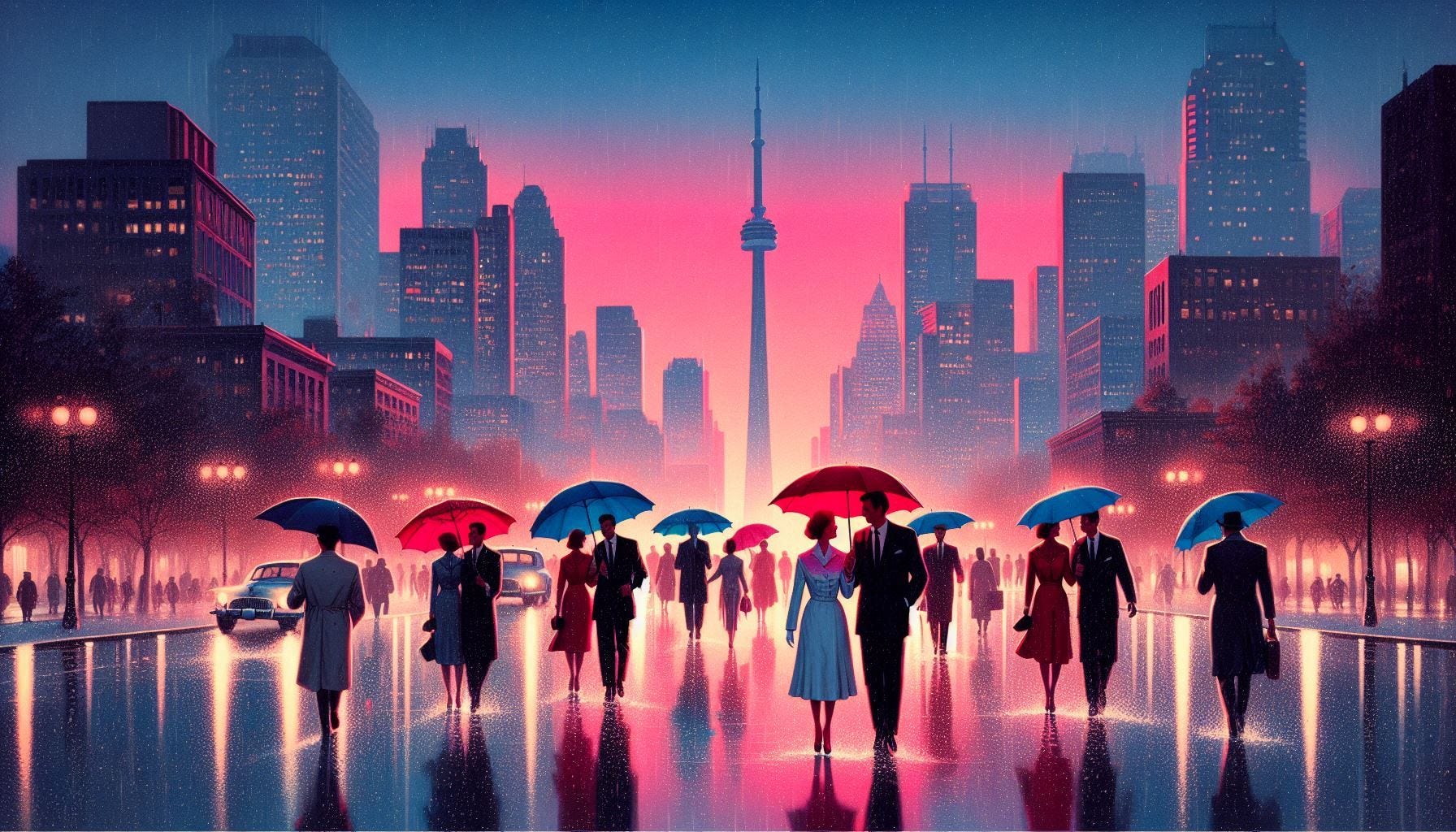
I like that it’s art deco. Inspired by the American creation of something new. What is praxeology if not that? I like the red blue, pink and cyan scheme. Nothing looks like it so it stands out and references the red pill thing without being too on the nose.
I don’t like that the umbrellas have the right idea, but are too abstract to mean anything. I have no idea what the book is about by looking at this, nor does it start a mystery that the text will solve by the end.
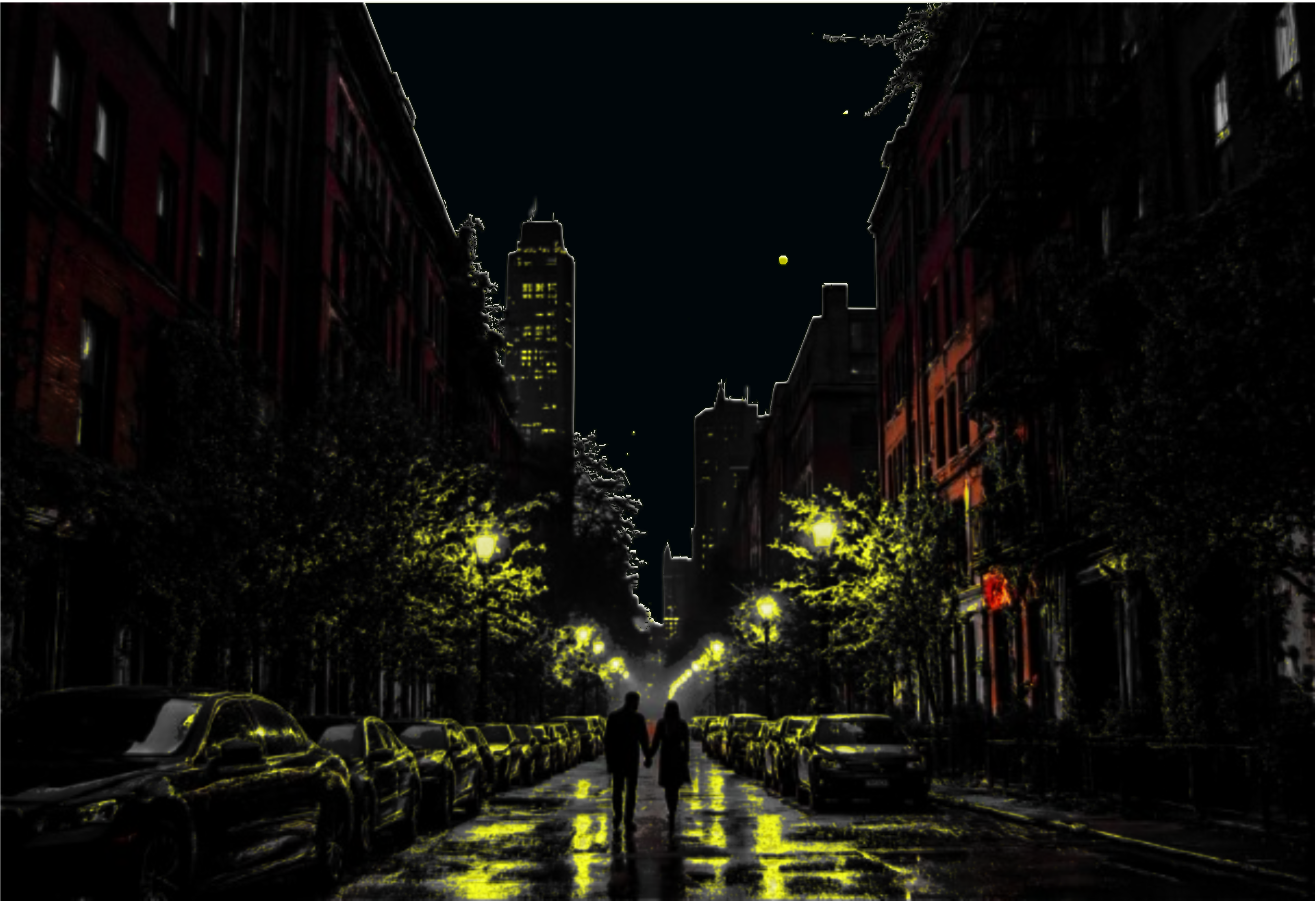
Other examples are the same. What is this if not a more boring version of the last one. Is this a batman novel or a set of field reports in a digest?
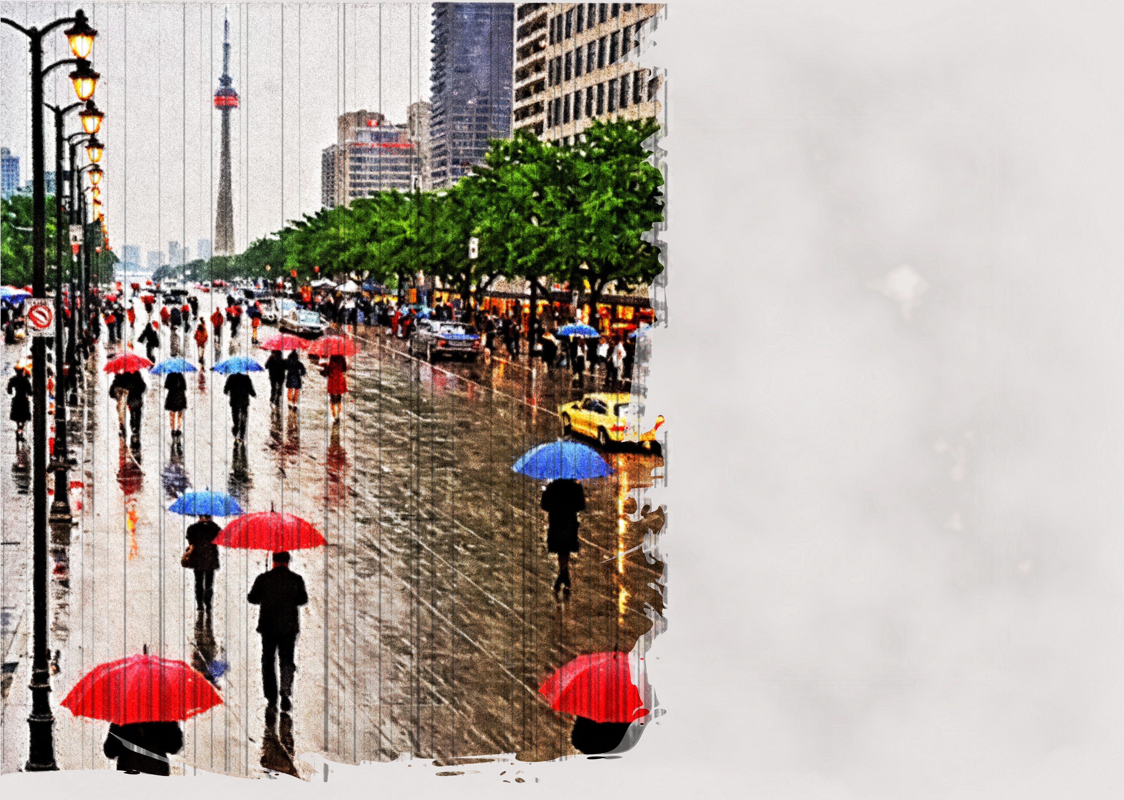
At least this one captures the slice of life effort of the field reports. The skeuomorphic distress of the page is a good option and I think I will keep it. It gives the impression that this is meant to be like a field manual, exposed to the elements. This isn’t art, this is mechanics.
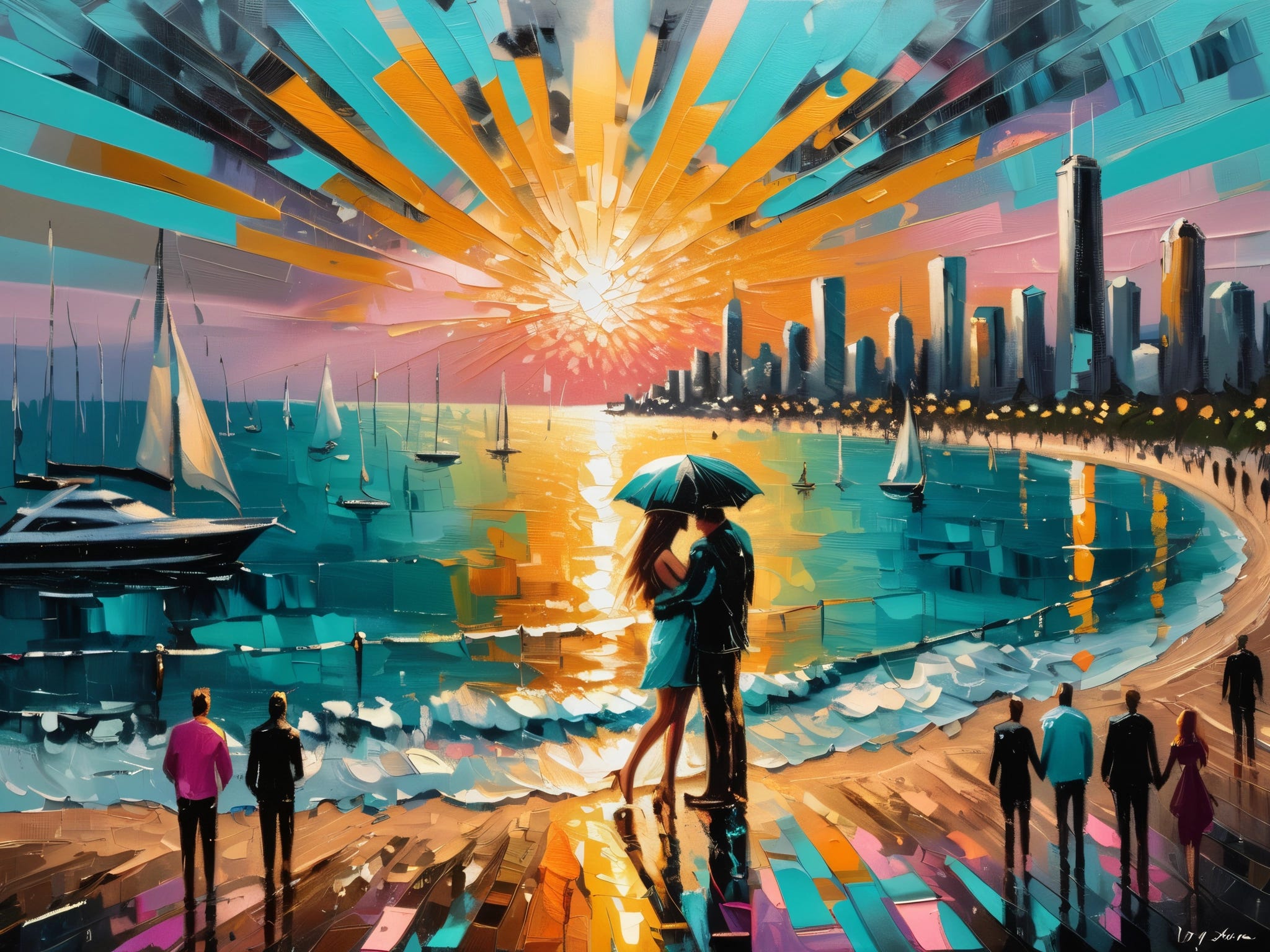
Orange and blue, the intellectual color scheme. It’s classic and works, but the problem is EVERY book does this so it has to stand out other than visually. I like the impressionist style, which was meant to capture a moment in time and not a realistic or naturalistic version of reality. It actually hints at the purpose of the book. It’s more slice of life than the first image.
I would probably change the color scheme to follow red, blue, pink and cyan though. Likely I’ll have 20 comprehensives all over the map and narrow it down to contrast other books in the genre
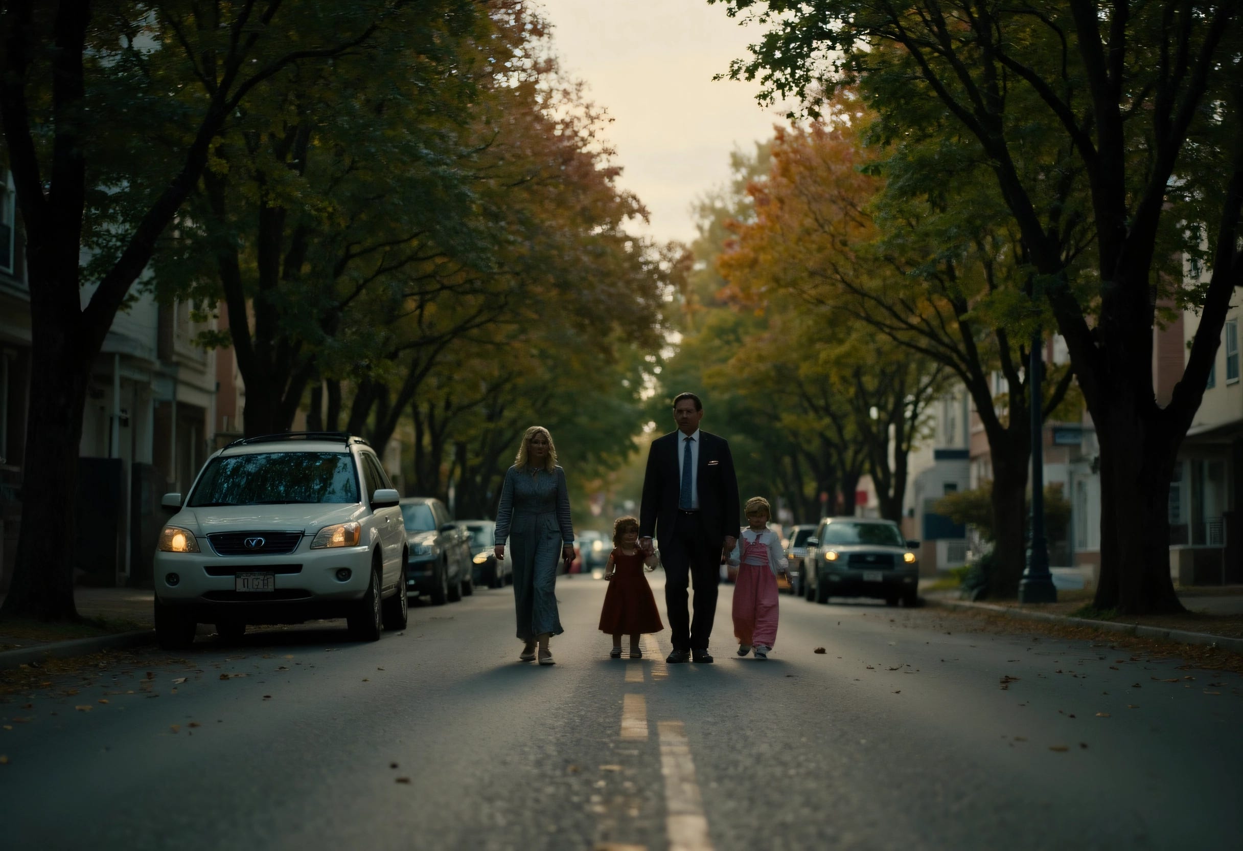
Hyper realistic is a choice, and not a bad one. It would be more like the 1970s pulp. I enjoy the aesthetic, but I don’t know if it sends the right message. Definitely wouldn’t work with my choice in a Readers Digest Bembo type choice. It would do better with Helvetica. Will that work with the text? I’ll have to test.
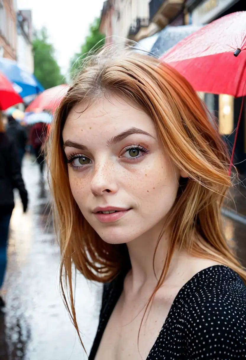
Close up shots of people… I don’t know if this works. I know people are more likely to pay attention to faces, female faces especially, and eyes more specifically.

For my workflow, this would be the easiest one to implement. There are no shortage of face photo shots, stock art etc that would be available. Then again, the last thing I want is for people to see this as some sort of political ghost written memoir. Will the typography choices create enough distance?
Choices
The next step is to do up comprehensives of all this, put them into a grid and check for theme, visual appeal, consistency with the text and type choices. Hundreds of examples, narrowed down to three. From there, create three final comps and then pick a final cover. thank you for sticking with me on this path.
COMPS
While I was playing with the hues, I noticed it might work with just simplicity. Color, title, layout. Will come back to this later
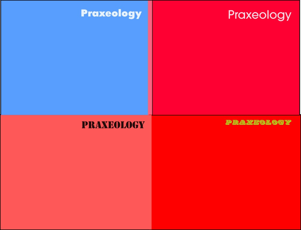
This is where the magic happens. It’s a continuous process. Take as many ideas as you can muster, and make 20 or so variations of each. Make them into rough comps and then look and get your instinct to work here.
What stands out?
What looks professional?
What looks amateurish
Is there anything that strikes you as unique?
Grab the top 5 and then refine them further. Take that collection and narrow down to 3, then make 3 finished covers and pick the one that works (not the one you like, the one that works. There’s a big difference. You can’t just think of it as a likeability exercise.)
Does this grab the readers attention?
Does the layout compliment the writing or does it detract?
Does the image or the text dominate? why do you want it to?
Colors, shade, tone, tint: put this in the Amazon library with your peers. Do you get lost in the sea of covers or can you grab that littlest extra attention you need for a sale?
Does everything communicate congruently, or is it grandmas silverware drawer? (am I communicating chaos, that may not be a bad thing?)
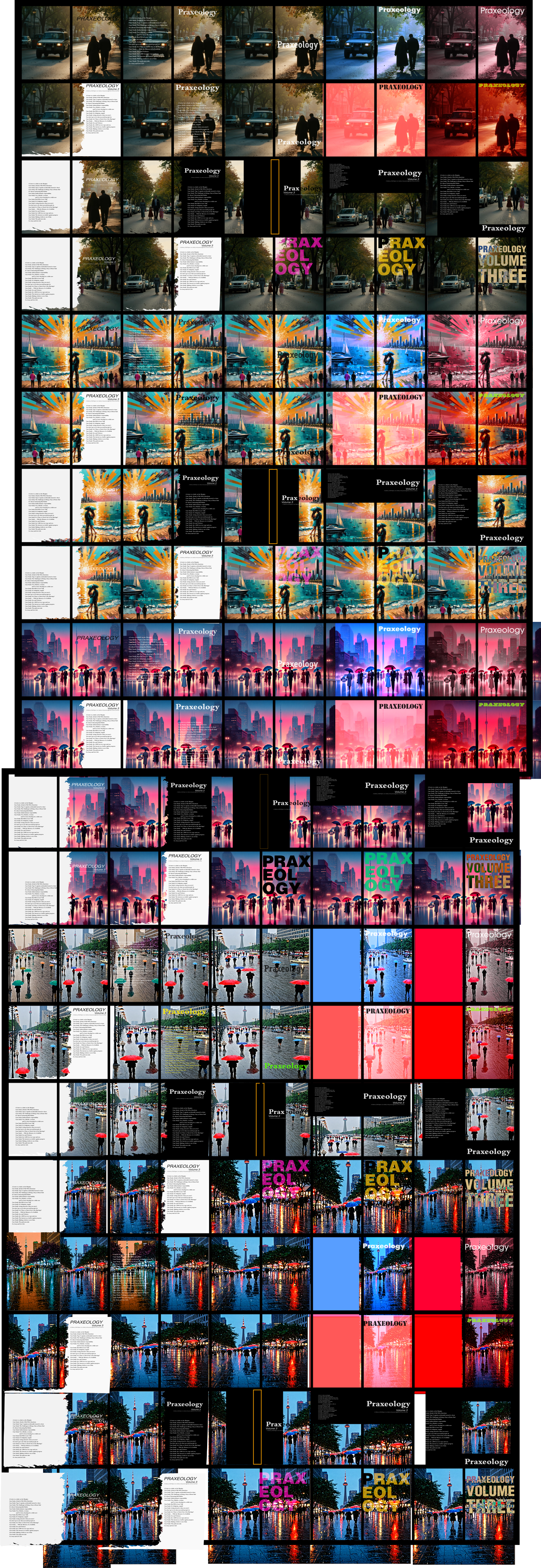
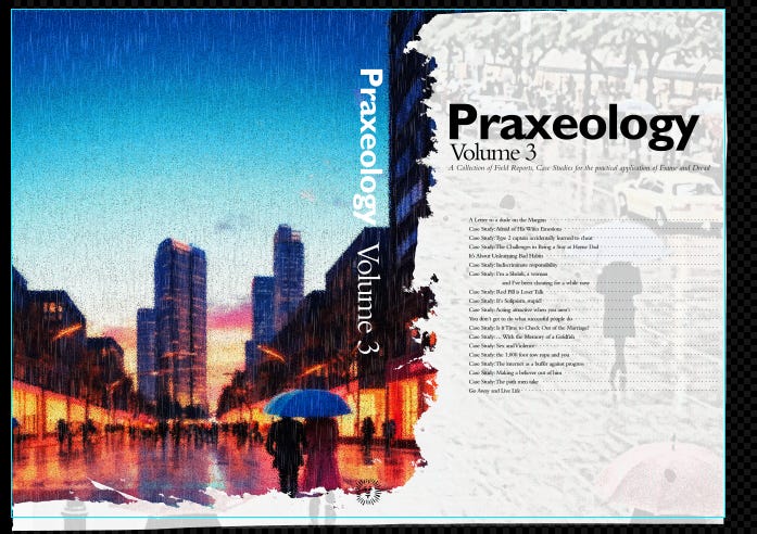
This will be the one. I don’t know how it will look front cover only on amazon, but it seems trivial to swap the composition…
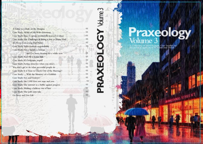
Either way. Gill Sans and Bembo, who’d have thunk?
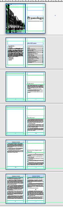
Next is the desktop publishing. I have already edited this too much, but the process is more mechanical at this point.
Amazon margin/bleed requirements. Make sure all your text fits their printer
Chapter starts on a right page. If you want to start it wherever, then be consistent
Page numbers. roman numerals for preamble, numbers for the chapters
Title and or Chapter headers. Don’t use them on chapter title pages
Ensure images meet printer requirements (no full color on BW press, DPI and bleed reqr)
All type choices should be consistent. Same size, kerning, leading, tabs, consistent use of italics, bold
Standard books are 11pt typeface, 12 if you are making one for children or the elderly. Break this rule only if you know the rule
The more consistency and patterns you have for your text, the less people get taken out of the text. This sounds mundane, but the reader experience is paramount. You’re shoveling the driveway, so no one will notice unless it’s not done. Don’t waste a year of your life writing a book only to have the person get a headache by parsing your text
A couple of the images remind me of the Red Morning intro . But I know you’ll pick the best image for your cover. Have a great week !