


Writing isn’t the most important job as a self publishing author. Marketing is. And there is no more important marketing than the cover design. It’s the first thing people see when they look for a book, it’s the first thing bystanders see when people are reading it in public. A guy wants to flirt with a girl he sees at Starbucks, a girl wants to start a conversation with a cute guy at college, the easiest ice breaker is:
“What is that book? Is it any good?”
You can help people find love and at the same time encourage more people to read and buy your work. But people are proud, they are scared of new things and they would prefer to complain that artists charge too much for a cover. If they really cared about their book they would make a cover that does it justice.
A good cover has a few mandatory goals and some optional ones:
Catch a viewers attention for long enough that they consider buying it
Not embarrass the person in their reading environment
Accurately (or dishonestly) give the person an impression about what the book is about and who it’s for.
Look cool on a bookshelf or coffee table for brand identity (if you don’t get this one, talk to a former university chick who had a Bukowski book on her table to show how cool and artsy she was)
Praxeology, volume 3
My original career was a desktop publisher and graphic designer. Prior to joining the military I caught the tail end of the industry before it disappeared. So this isn’t the greatest designer you’ve ever heard of’s how to guide, it’s competent professional design and publishing, and that’s good enough.
I have posts about my volume 1 and 2 cover designs here. They are more stream of consciousness, and reflect the chaotic process I used in designing them.
Final Round of Comprehensives

As it stands there’s 3 theme: Aspirational, revenge, and descriptive covers. I have a few of each and now it’s time to choose. The only major change I could make right now is to have the middle bottom picture as a reflection in the sunglasses to the revenge photos 1 and 2, but that’s it.
Basics of Cover Design

A few of you liked the livestream where I showed you how to use graphic design to build a book cover, so I figured I’d add the work here as I go.
When making any creative decision, the only question you have to answer is “What is this meant to accomplish?” Because with every detail, you’re telling a story. If you have a manuscript I shouldn’t have to explain why this is important. Typography, images, text and design are the 4 main things to consider.
Typography
Type matters. It’s not a font, it’s a typeface. typefaces are designed for specific purposes and it’s worth looking into why Eras, Helvetica, Caslon and Arial exist, and what their purpose is.
Helvetica is a swiss designed sans serif font from the 1950s. It’s meant to be clean, modern, and universal. It’s not supposed to have a flavor, it takes on the flavor of what you pair it with. It has a x-height of ~50%. If you don’t know, x height is the different between a lower case and upper case xX. The reason this matters is, for print the height is larger than for the screen. Unless you have a reason to use an 80% x-height typeface like Arial, using it for print looks clunky. Using a 50% x-height on your e reader is hard to read.
So why use one over the other? Be deliberate. If someone asked why you chose Arial over Helvetica, the reason needs to make sense and not be a post-hoc justification. Maybe you want a clunky title because the book is meant to be clunky. Maybe it’s supposed to look amateurish for some creative reason and Arial is an artful dishevelment with an otherwise put together cover. Be deliberate.
It is also about pairings. I’m sure there’s objective metrics but I mostly go with subjective instincts myself. contrast between a title typeface and a subtitle typeface. Here’s a random example I pulled off the net.
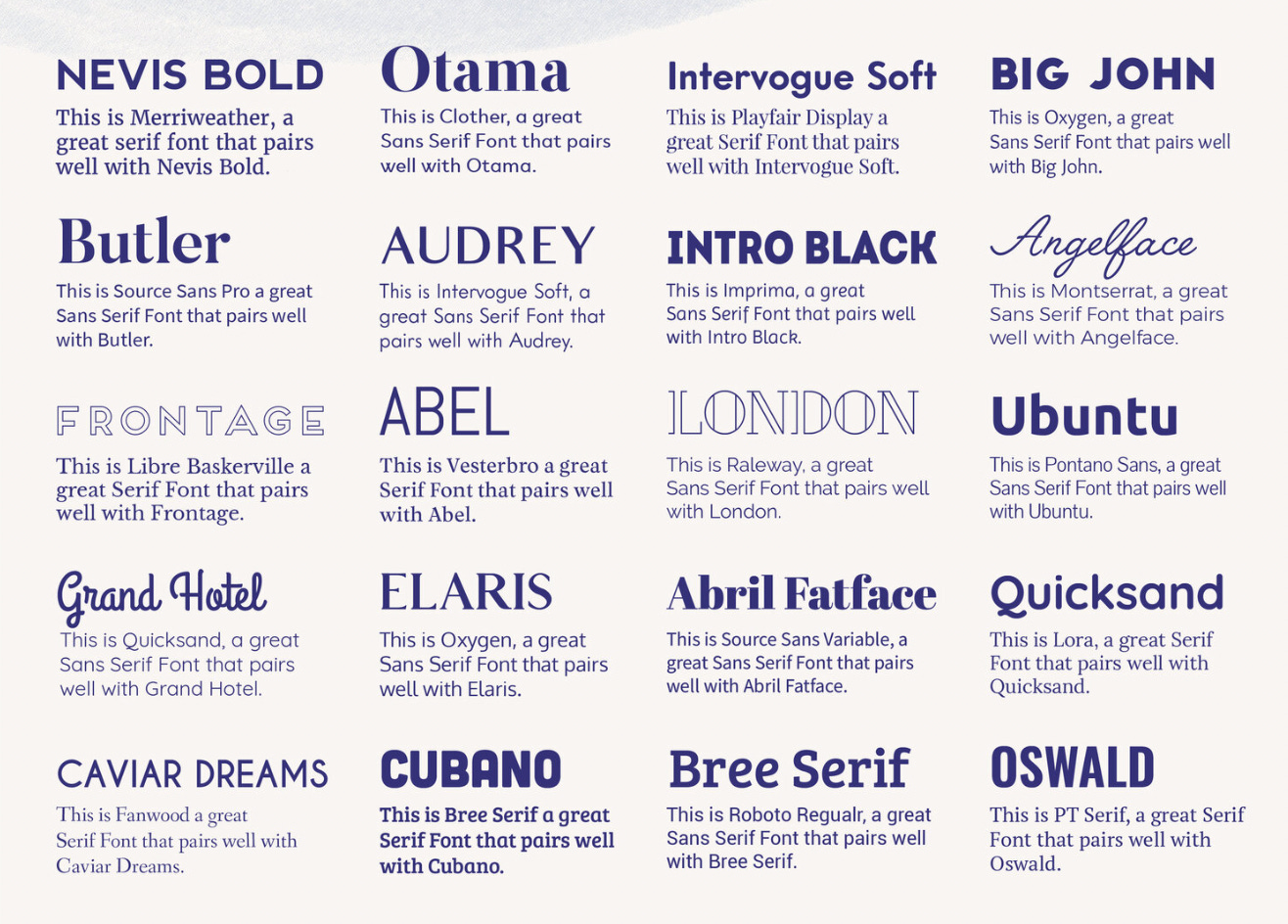
Notice how you can tell at a glance which are pairings for print and which are pairings for the screen? The idea here is to either juxtapose or to compliment. Be deliberate. If you want a jarring difference, what is that meant to convey? If you want a smooth transition, what is that meant to convey? I’ll use mine as an example
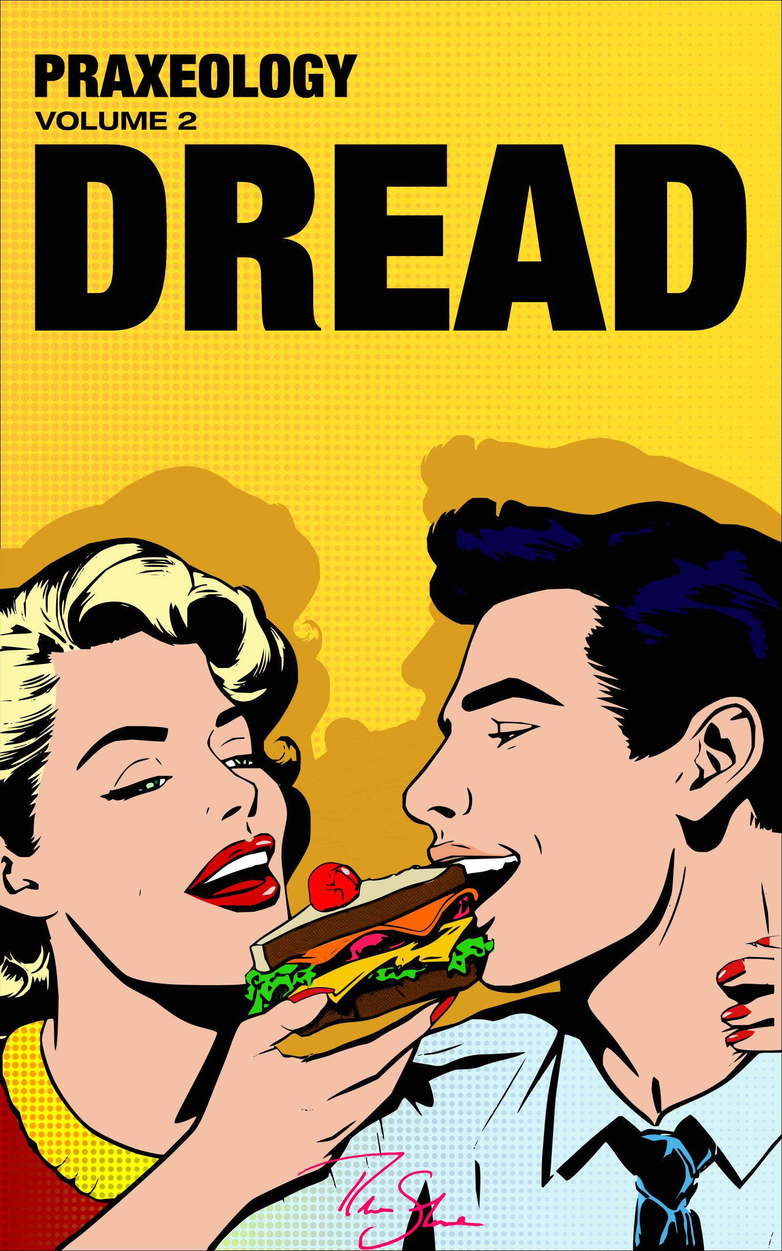
I used Helvetica Black, expanded medium, and Bold. It’s meant to be plain and simple. I wanted to avoid any emotional connections because this is a book about failing men and failing relationships. If I make it look old timey it may throw off people who think it’s a traditional conservative screed. If I make it look funky and modern it throws off Christians who don’t want to cheat or divorce, but just want a wife to suck less. You’re not supposed to take anything from the title other than an order of focus. Dread, then Praxeology, then volume 2.
They know the book, the know it’s not ideological or religious, and that there’s another one out there if you like. Previous versions don’t quite work
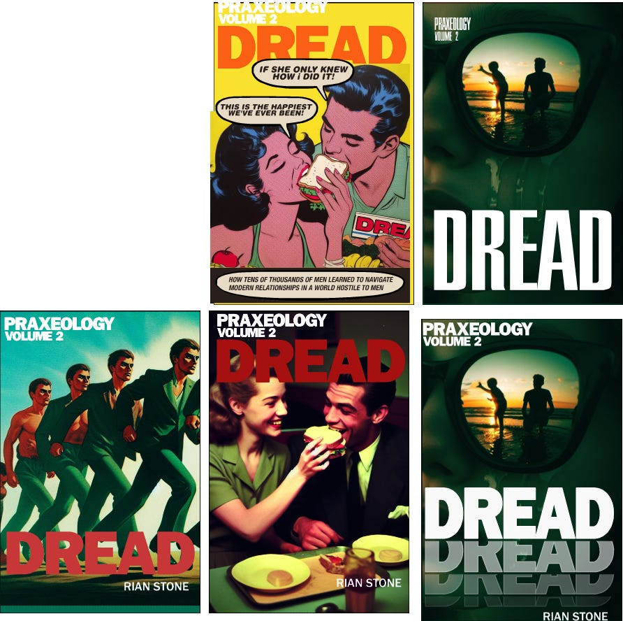
Starting from the top and working left to right, the first one makes people think it’s a comic book. The second is difficult to read from a distance. the third one assumes my name will be a selling point (it’s not) and there’s too little contrast. It doesn’t guide the user through the focal points. The fourth is close, but is crowded out by the images and doesn’t balance well, it looks awkward and can be off putting and amateurish. And the last one looks like a fiction-thriller which isn’t accurate.
So learn why type faces are the way they are:
Caslon: developed in the 1500s, the most legible serif font. Serifs took into account lead in the printing presses and can imply a longevity or classic nature of your work.
Audrey: Avant Garde, 1930s typeface. Great for city, period pieces. an already established aesthetic
Cooper: 1980s bulky text. Great for signage. Has a modern classic vibe and is more analogue and less digital
There’s thousands of options, so sometimes going classic with Caslon or Helvetica is best. It’s clean and competent. Rollo always laughs at Garamond, an Italian typeface from the 1600s and calls it the typeface for people who don’t know what else to use. It’s vanilla flavored text.
And the final point is that text is more than words, they are graphic elements. That’s a design issue though, but for starters, hold your cover upside down and notice how they become graphic elements. Take that into account.
Images
Take it off the internet, pay for a commission, use AI. I don’t care about all that. Everything looks good when someone good uses it. I can’t teach you how to art, but I can show you what to look for
Focal points. People view the elements of a page in a specific order. Each element of focus is called a focal point. The order you view them in is called the focal path. For western readers, we naturally default to a ‘z’ shape. For Islamic or Asian cultures, it’s different. top to bottom right to left, you get the idea.
You can deviate from that, but again, be deliberate. My cover is a line from top to bottom. Not trying to be clever or create a dance. brutalist, efficient, top to bottom, get it? So the ways you can define focal points are by contrast and human psychology. For example:"
Larger items appear closer than smaller ones
Higher objects appear closer than lower ones
Human faces are more important than objects
Female faces are more important than male faces
Eyes are more important than faces
Light objects are more important in dark compositions
Dark objects are more important in light compositions.
Contrasting colors create a vibration at their borders because our cones are having to switch. This usually annoys the eye. We try to avoid them.
This isn’t an exhaustive list, but gives you an idea how to organize your image for a proper focal point and path. Ideally, it’s like a story. Prioritize the information you want the user to get and lead them through the path. They won’t notice if you’re doing it correctly. But they will notice if you aren’t. The ease at which it happens gives a reader a subconscious confidence in your work. When things flow people assume competence. It’s like a house. You’re more likely to trust it’s constructed well if you don’t have wires sticking out of the walls, the garden is manicured and a the walls have a fresh coat of paint.
The final thing to consider is where the text will be. If you have a busy background then the text will get muddled behind it. You can mitigate that with a stronger and bolder typeface, or a colored semi transparent band behind the image. This however alters the text choices, and the band separates the text from the image. Why have them separate? Do you know what you’re conveying?
A two world type book may benefit from that. Real life mundane text with a band juxtaposed with fantastic busy images in behind. A slice of life story may not. Don’t forget, a black band now has an effect on the focal path.
Be deliberate.
Test and Design
I’ve mostly done that already in all the previous text, but it’s helpful to be aware of your constraints. UPC code placement means the centre bottom of an image is not a good place for anything important. A landscape image will cover front and back covers. The right side of the image will be the important half while the left half is relegated to the back cover. The spine can influence how things will look. A thinner spine will hide any details in the middle. Maybe you want a portrait and only use the front cover, leaving a plain color for the back. In a bookshelf you can only see the spine. You have a very thin space to portray all the choices you made for the cover and text. how will you accomplish that?
Is it part of a series? Do you want consistent choices throughout or just have a single element to connect them? Same font choices, same book color, maybe just a logo that they all share in similar spots on the spine.
There’s no wrong answer, but be deliberate and make sure it works.
Also, designs are often taught to the audience. People who make romance novels have a standardized design. If you are writing one and want to look like a big boy book, you may be OK with replicating that for your book. Make it too different and people may not know it’s a romance book.
Mine are fairly unique in the space so I didn’t worry about that as much. I want people to take the material seriously, but not literally. The choice of a golden age of comics was to make people think of those old comic ads for seamonkey’s and such. Solve your problems, don’t treat this like a bible or some authority. have an element of playfulness.
Does it work? Who knows, but I’m in my own space so if and when it does, guarantee that other books will start to replicate it. Similar to how Rational Male’s books had a skeuomorphic leather bound book cover. I had to account for this in mine because we share a similar audience and I don’t want people to think it’s just Rollo but from another guy. So the separation of content was important.
So you don’t expect the same book, and you won’t receive it.


For book 1, it is a different style. Same typographic layout, but closer. 10,000 foot view of sexual dynamics vs 5 inches from your face. the book is painted, the text, the paint splatter on the side. It’s not a guide or a description, you’re creating something that isn’t given to you. See if you notice the focal path and why it’s there.
the texture is there to make it look patina. It’s a different way to achieve the same timeless look Rollo did. Pre worn, like the book digs ditches for a living. It’s not some ivory tower abstraction, it’s hard working people getting their hands dirty.
Summary
This stuff is subtle, and if you’re doing it right no one will notice. But as the first and most important part of your book, write a story about what is inside. And remember, if you don’t give a shit about your cover, why should a potential customer assume you gave a shit about what’s inside either?
And this is only about the general idea of what you want. There’s a whole other beast involved with getting here, but this is already too long.
I like your idea of the bottom middle cover as a reflection of the sunglasses in the cover following it. My $0.02.